Rainbow Row is the postcard version of Charleston—those candy-colored houses lined up along East Bay in perfect, almost theatrical harmony. Most visitors photograph them and move on. I kept going back with a quieter question: what would happen if you stopped treating the colors as decoration and started treating them as a working palette for a real house?
Not the saturated, tourist-facing versions. The softer, more lived-in notes that appear when the light is less dramatic and the paint has had a few years of Lowcountry weather. Those are the colors that travel.
What I actually took home
I did not come back with a list of exact paint matches. I came back with relationships.
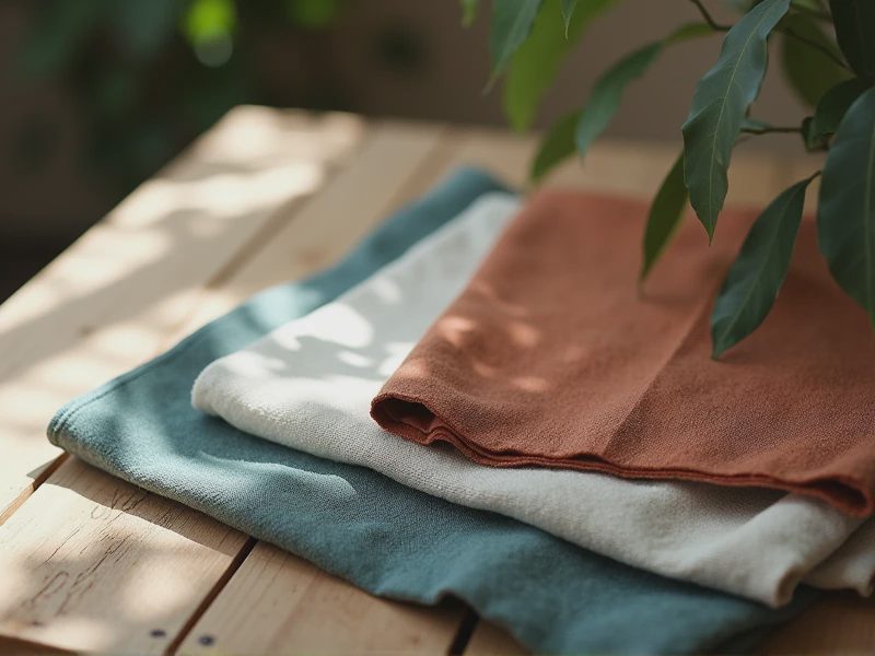
There is a soft coral that is closer to weathered brick than to lipstick. A pale yellow that never tips into citrus. A blue-green that sits somewhere between sea glass and the underside of a leaf. A deeper teal that holds its own in shadow. And the quiet neutrals that make all of them possible—warm whites with a little sand in them, soft grays that lean toward taupe rather than cool steel.
The important part is not any single hue. It is how they sit next to each other without competing. Rainbow Row works because the colors are allowed to be distinct while still belonging to the same family of light and air. That is the lesson that matters inside a house.
Translating postcard colors into rooms
In a living room or bedroom, the full-strength Rainbow Row palette would feel costume-like. The versions that work are the ones that have been softened by the same forces that soften everything here: humidity, strong sun, and time.
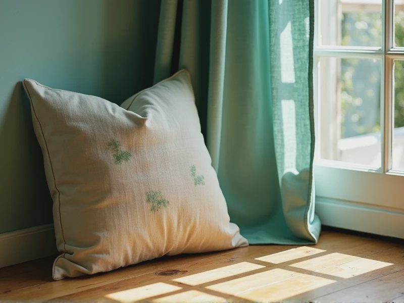
I use the coral as an accent in textiles more often than on walls—a pillow, a throw, the binding on a curtain. The pale yellow appears as a wall color only in rooms that get gentle light; in stronger light it needs to be muted further or it starts to shout. The blue-greens are the most versatile. They sit comfortably on cabinetry, on the inside of a bookshelf, or in a linen curtain that filters the afternoon sun. The deeper teal anchors. It is the color I reach for when a room needs a quiet, grounded note that still feels tied to this place.
The neutrals do the heavy lifting. Without them the brighter notes have nowhere to rest. A warm, slightly complex white keeps the whole palette from feeling chalky. A soft, earthy gray prevents the pastels from floating away into pure prettiness.
How light changes the theft
Charleston light is not neutral, so neither are these colors once they are inside. Morning light pulls out the cooler edges. Late-afternoon light warms everything and can turn a careful blue-green slightly murky if the undertone is wrong. I have learned to test anything in this family at more than one time of day, preferably on a humid afternoon when the air itself is affecting how color is perceived.
This is why I almost never specify these hues from a fan deck alone. I want to see them in the room, on the actual surface, under the actual sky. A color that looks charming on East Bay at noon can feel entirely different on a north-facing wall in August.
Living with the palette
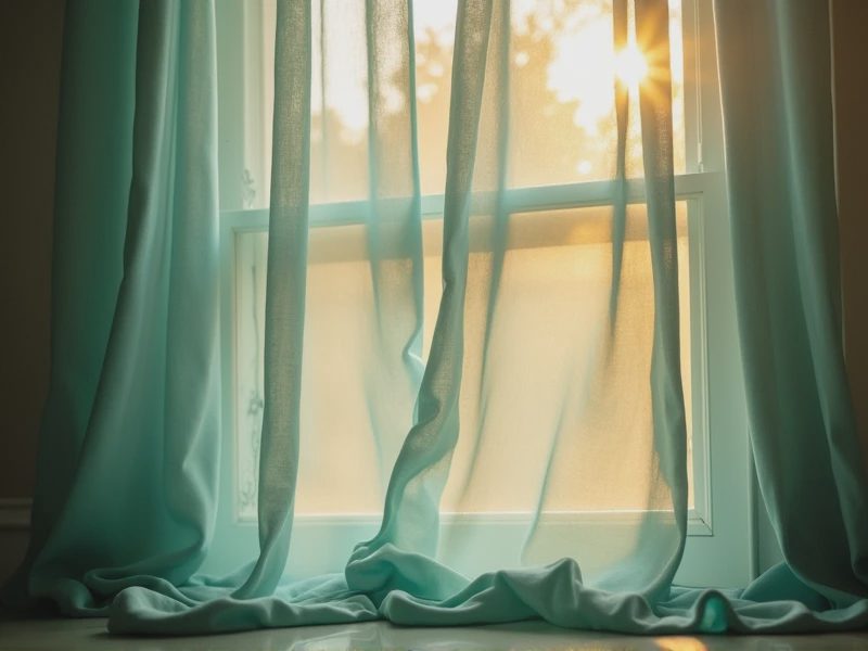
In our own house the borrowings are quiet. A cushion that carries a softened version of the coral. Curtains with a hint of that sea-glass blue-green. A painted inside of a cabinet that surprises you only when you open the door. Nothing announces “I went to Rainbow Row and took notes.” The colors simply feel as if they could have grown here.
That is the real test of a stolen palette. If the room starts to look like a reference, you have taken too much. If the colors settle in and start to feel inevitable, you have taken the right amount.
I still walk past those houses when I am downtown. I still notice how the light moves across them and how the colors shift with the hour. But I no longer see them only as a postcard. I see them as a set of permissions: permission to use color that is specific to this place, permission to let it be soft rather than saturated, and permission to let the light do some of the work.
A soft room is a room that breathes.
Sometimes the palette that helps it breathe is one you borrow from the street and then quietly make your own.
— Caroline