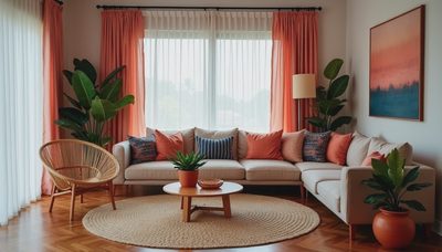
A gallery wall layout can turn a blank hallway, stair landing, or living room wall into the part of your home everyone remembers. The trick is not buying a dozen matching frames and hoping they behave. It is creating a little visual conversation between art, photographs, textiles, and the room around them. In my house, the arrangement above the sofa has survived a six-year-old, a curious tabby cat, and more than one enthusiastic redecorating phase. It is not perfectly symmetrical, and that is exactly why it works.
Start with the wall, not the artwork
Before you collect frames, study the wall you want to fill. Notice the furniture below it, the height of nearby doors, the direction of natural light, and the way people move through the room. A gallery wall should feel connected to something grounded, such as a sofa, console, staircase, or dining table. Floating art in the middle of a large wall can look accidental, even when every individual piece is lovely.
For a sofa wall, leave roughly six to ten inches between the top of the sofa and the lowest frame. This keeps the arrangement connected to the furniture without making anyone feel as if the art is leaning into their head. Over a console, begin a little higher if lamps or tall objects sit below. A good gallery wall layout usually occupies about two-thirds of the furniture width, though a narrow vertical grouping can be beautiful beside a bookcase or fireplace.
Pay attention to the room's existing colors. You do not need every print to match the rug, but repeating one quiet shade can make the collection feel intentional. A faded blue from a landscape, a warm brown frame, or a small touch of terracotta may be enough.
Choose a mix with one steady thread
The most welcoming arrangements have variety and repetition. Mix a family photograph with a botanical print, a small oil painting, a child's drawing, or a textile mounted in a simple frame. The art does not need to share a subject. It needs a relationship, and that relationship can come from color, frame finish, era, or mood.
When I build a gallery wall layout, I usually choose one steady thread first. Maybe the palette is cream, olive, and faded rose. Maybe the frames are mostly oak and antique brass. Maybe every image feels a little nostalgic. Then I allow one or two surprises. A bright abstract print or a silly vacation photograph keeps the wall from looking like it came directly from a showroom.
Vary the sizes, but do not make every piece a different shape. Two or three larger anchors help smaller works feel supported. A 16-by-20-inch print might serve as the visual center, with 8-by-10-inch photographs and smaller 5-by-7-inch pieces gathered around it. If everything is tiny, the wall can look timid from across the room.
Frames deserve practical consideration, too. Wood brings softness, metal adds a little polish, and painted frames can bridge older and newer pieces. If you have young children or pets, acrylic glazing is lighter and less fragile than glass for artwork placed in a busy walkway.
Make a paper plan before touching a nail
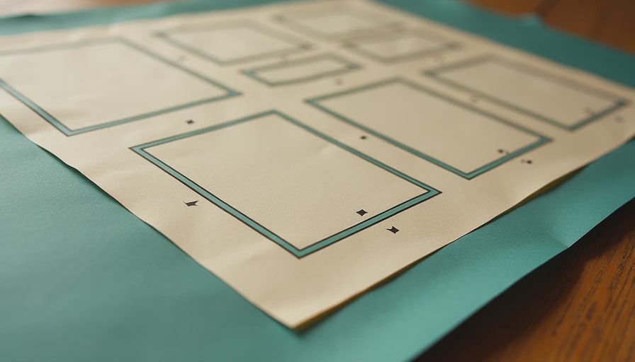
The easiest gallery wall layout to revise is the one still on the floor. Trace each frame onto kraft paper, newspaper, or the back of opened grocery bags. Cut out the shapes, label them with the artwork or frame color, and arrange the pieces on the floor. Start with your largest anchor, then place medium pieces nearby before filling gaps with small ones.
Leave two to four inches between most frames. A slightly larger gap can work around a substantial piece, but uneven spacing is what makes a collection feel unsettled. Stand on a chair or step back ten feet while you arrange. A grouping that looks balanced close up may feel heavy on one side from the doorway.
Once you like the floor plan, tape the paper templates to the wall. Live with them for a full day if you can. Look at the arrangement in morning light, lamplight, and the distracted state of mind that happens when someone is asking where their missing shoe went. That final test is surprisingly useful. If one piece keeps catching your eye for the wrong reason, move it now.
Give the center a natural resting place
A gallery wall layout feels calm when the visual center sits around eye level, usually about 57 to 60 inches from the floor to the center of the grouping. This is a starting point, not a commandment. In a room where everyone sits low, the art can come down. In a tall stairwell, the arrangement should follow the slope and the architecture rather than forcing a single horizontal line.
For a symmetrical grid, measure carefully and keep the outer edges aligned. This approach suits orderly spaces, black-and-white photography, and collections with identical frames. For a more relaxed salon arrangement, align a few edges while letting others shift. The secret is controlled irregularity. Nothing should look like it was placed with a blindfold, but nothing should look nervous either.
Do not forget the empty space around the grouping. A wall needs breathing room just as a room needs breathing room. If the art reaches the crown molding, door casing, and furniture below all at once, it can make the room feel crowded. Pull the outer pieces inward until the arrangement has a clear boundary.
Hang it securely and make it livable
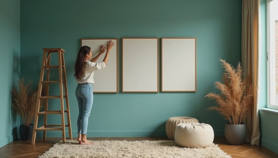
Use hardware suited to the weight of each frame and the wall surface. A lightweight print may need only a picture hook, while a heavier mirror or substantial frame should be anchored properly. On drywall, locate a stud when possible; when it is not, use a rated wall anchor rather than trusting a tiny nail. In a rental, removable hanging strips can work for light pieces, but follow the package weight limits and avoid using them on dusty or delicate paint.
For frames with two hanging points, measure the distance between the points instead of guessing. Mark the wall with pencil, check the level, and then press the frame into place. Keep a small gap between art and a heat source, and avoid hanging irreplaceable paper in direct sunlight. A sheer curtain or UV-protective glazing can help reduce fading in a bright room.
A family gallery should also be touchable without being dangerous. Keep low pieces away from sharp corners, and place treasured originals higher if little hands or curious paws are part of daily life. The prettiest gallery wall layout is one you do not have to police every afternoon.
Let the collection grow slowly
You do not need to finish the wall in one Saturday. Start with the pieces you already love, then add thoughtfully over time. A frame from a flea market, a child's watercolor, or a small print found while traveling can bring more feeling than a rushed set purchased all at once. Leave one or two spaces open if the wall is meant to evolve.
If the arrangement feels flat, add texture rather than more objects. A woven piece, a small carved frame, or a deckled paper edge can create depth. If it feels chaotic, remove one item and see what happens. Editing is often more effective than adding.
The right gallery wall layout should look collected, not manufactured. It should carry a few stories, echo the colors already living in the room, and leave enough quiet around itself to feel generous. Start with the wall, make a paper plan, check the spacing, and trust your eye. A soft room is a room that breathes. Let us make yours exhale.