If you have ever stood in the paint aisle holding a red cushion and wondered what is the opposite of red, you are asking a better design question than you might think. Color opposites are not just trivia from an elementary-school wheel. They help a room feel balanced, especially when one shade is loud, warm, or emotionally bossy.
The short answer is green. On a traditional artist's color wheel, red sits directly across from green, making them complementary colors. But homes are not diagrams, and the perfect green depends on the red you are working with, the light in your room, and whether you want a lively contrast or a quieter exhale. Let's make the idea useful rather than precious.
Start with the classic color-wheel answer
When someone asks what is the opposite of red, green is the standard answer. Red is a warm primary color, while green is made by combining blue and yellow. Because they sit opposite each other, the two shades create strong visual contrast when placed side by side.
That does not mean you need a bright Christmas-green wall beside a fire-engine-red sofa. Complementary color is a relationship, not a shopping list. A softened sage pillow can balance a brick-red leather chair beautifully. Olive curtains can settle a room with rust-colored art. Even a small green vase on a red-toned bookshelf can make the red feel intentional instead of accidental.
The trick is to control intensity. Highly saturated red beside highly saturated green feels energetic and graphic. Muted versions feel collected and grown-up. Think tomato red with dusty eucalyptus, or cranberry with gray-green. The color wheel gives you the direction; your home supplies the volume.
Why the exact shade changes the answer
The question what is the opposite of red becomes more interesting once you name the red. A clear, cool red with a blue undertone may look best against a blue-green or emerald shade. A warm terracotta red leans toward yellow, so olive, moss, or muted sage can feel more natural beside it.
Hold fabric swatches together in the actual room rather than judging them on a phone screen. Charleston sunlight, a north-facing bedroom, and a lamp with a warm bulb will all change what you see. My own red dining chair looks almost cinnamon-colored in late afternoon. Next to a blue-leaning green, it becomes richer; beside yellow-green, it looks more orange.

A useful test is to photograph the swatches in the morning, afternoon, and evening. If the combination still feels comfortable after the room changes, you have found a workable pairing. If one color seems to vibrate, lower its intensity before abandoning the whole idea. A dusty version of either shade often solves the problem.
Green is not one single decorating answer
If you search what is the opposite of red, you will see green named quickly, but green has a whole family of personalities. Sage is soft and forgiving. Olive feels earthy and slightly old-world. Forest green adds depth and works especially well with warm wood. Mint is fresher and more playful, while emerald brings polish and drama.
For a family room, I often prefer a gray-green because it can handle toys, books, brass, and a red patterned throw without making the room feel themed. In a bedroom, a deep green headboard can give a small amount of red in artwork or a rug somewhere to land. In a kitchen, even a bowl of green pears can balance red clay pottery.
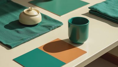
You do not have to use paint. Color can arrive through a linen pillow, a woven runner, a faded rug, or a velvet ottoman. Soft furnishings are especially helpful because they let you test a relationship before committing to four walls.
When blue-green may be the better companion
Sometimes green feels too obvious. That is when blue-green earns a place in the conversation about what is the opposite of red. Teal, peacock, and muted petrol shades can counter red while adding a cooler, more layered feeling.
Picture a cranberry lumbar pillow on a sofa with a blue-green throw. The contrast is present, but it does not announce itself like a holiday display. Pairing a washed red with teal also works in rooms that already contain walnut, black metal, or creamy walls. Those neutral materials give both colors somewhere to breathe.
This approach is lovely in a reading corner. Try a rust chair, a blue-green footstool, and an ivory lamp shade. Add one small brass detail rather than several shiny accessories. The result feels warm and personal, not like a color exercise taped to the wall.
How to use complementary color without overdoing it
The safest way to use what is the opposite of red in a real room is to choose one dominant color and let the other play a supporting role. A room might be mostly warm white, oak, and flax, with red appearing in a rug. Green can then show up in two or three smaller places: a pillow, a plant pot, and a framed botanical print.
Another simple proportion is roughly seventy percent quiet foundation, twenty percent secondary color, and ten percent accent. These numbers are not a law. They are a way to stop every object from competing for the same front-row seat. If your red is already strong, use green in faded or natural textures. If the green is deep and dramatic, keep the red to small, repeated details.
Repeat the relationship at different heights. A red book on a low shelf, green stitching on a cushion, and a small red flower in a vase will feel more connected than one red object stranded across the room. Repetition makes contrast look planned.

A practical swatch exercise for your next room
To test what is the opposite of red in your home, gather three red samples and three possible green companions. Include fabric, paint cards, or objects you already own. Place them on a white sheet near the largest window, then step back at least six feet. Designers do this because color looks different at arm's length; you should too.
First, remove the combination that feels too bright. Next, remove anything that disappears against the wall or upholstery. Finally, leave the pairing that makes the room feel calmer or more alive in the way you want. Live with those samples for two days. Move them near the sofa, beside the curtains, and next to the floor. A beautiful pair in isolation can become awkward beside your existing wood tone.
If you are buying fabric, order a sample before purchasing yardage. A $5 swatch is much kinder than discovering that a $200 set of pillows has the wrong undertone. For washable family rooms, choose durable cotton, performance velvet, or a tightly woven linen blend, then let the color relationship do the decorating.
The answer you can carry forward
So, what is the opposite of red? Traditionally, it is green, but the most successful home is rarely built from one textbook answer. Sage, olive, forest, emerald, teal, and blue-green can all create a useful counterpoint, depending on the red and the atmosphere you want.
Begin with something small and real: a cushion, a bowl, a framed print, or a folded throw. Notice how it behaves in your light. Let the colors repeat gently instead of shouting from every corner. A soft room is a room that breathes. Let's make yours exhale.