Bathroom paint colors can change the entire feeling of a room before you replace a single fixture. The right shade makes a cramped bath feel considered, helps pretty tile look even prettier, and gives you a backdrop for towels, art, and the small daily clutter that makes a house a home. I have painted enough bathrooms to know that the color chip you love in the store can behave very differently beside a mirror at seven in the morning.
The goal is not a perfect, untouched powder room. It is a space that feels fresh when you walk in, forgiving when toothpaste lands on the counter, and warm enough that you do not feel like you are brushing your teeth in a doctor’s office. Let’s look at the shades and decisions that make that possible.
Start with the Light You Actually Have
The best bathroom paint colors begin with your room’s natural light, not a trend board. A north-facing bathroom usually receives cooler, softer light, so blue-gray or stark white paint can look chilly. Warm whites, creamy greiges, and gentle taupes help balance that blue cast. In a sunny south-facing room, those same warm shades may turn buttery, while a muted green, dusty blue, or soft stone color can feel beautifully settled.
Do not judge a sample only at noon. Paint a large piece of poster board and move it around the room, or brush two coats onto several sections of the wall. Look at it before work, after sunset, and with the vanity light switched on. A color that feels calm beside daylight may look surprisingly yellow under a warm LED bulb.
Your tile matters just as much. White subway tile with a cool gray grout welcomes different colors than creamy ceramic tile with beige undertones. Hold the paint sample beside the floor, countertop, shower tile, and metal finishes. A bathroom has fewer large surfaces than a living room, so undertones show up quickly.
Warm Whites That Still Feel Fresh
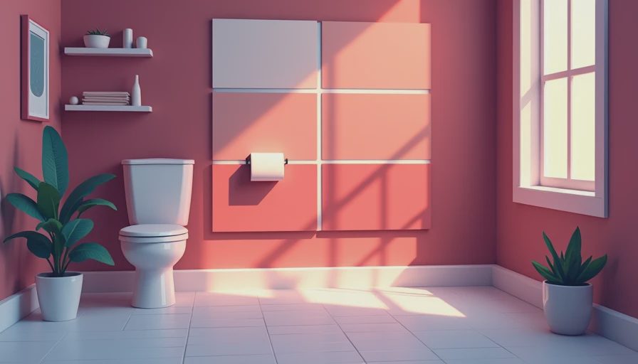
White remains one of the most reliable bathroom paint colors, but “white” is not one look. A clean neutral white can make a modern bath feel crisp, especially with chrome, black accents, and simple porcelain. A warm white is gentler and works beautifully with brass, oak, woven baskets, and older homes with creamier architectural details.
For a family bathroom, I often prefer a white with a little warmth rather than a brilliant gallery white. It gives towels and artwork room to breathe without spotlighting every water mark. Benjamin Moore White Dove, Sherwin-Williams Alabaster, and Farrow & Ball Pointing are useful starting points, though the surrounding finishes will determine how each one reads in your home. Always sample before buying several gallons.
If your bathroom is tiny, painting the walls and trim in a related white can make the edges recede. That does not mean the space becomes boring. Add contrast with a walnut stool, a striped shower curtain, a patterned Roman shade, or a blue-green vanity. The walls provide quiet; the textiles supply personality.
Soft Colors for a Calmer Bath
Some of the most livable bathroom paint colors are the ones that barely announce themselves. Pale sage, smoky blue, putty, and muted blush can make a bathroom feel restful without turning it into a themed space. These colors are especially lovely in a primary bath where you want the first few minutes of the day to feel unhurried.
A gray-green is a wonderful bridge between white fixtures and natural materials. It looks fresh with oak and aged brass, but it also handles black hardware without becoming severe. A dusty blue pairs easily with white tile and navy towels, while a warm beige can soften a room full of glossy surfaces.
Keep the rest of the palette simple. If the walls have a noticeable color, choose two or three supporting tones for towels, art, and accessories. In my own home, a soft blue wall would be paired with ivory towels, a faded terracotta pot, and a small framed print rather than six competing accent colors. A room can have character without shouting.
Bathroom Paint Colors for a Small Powder Room
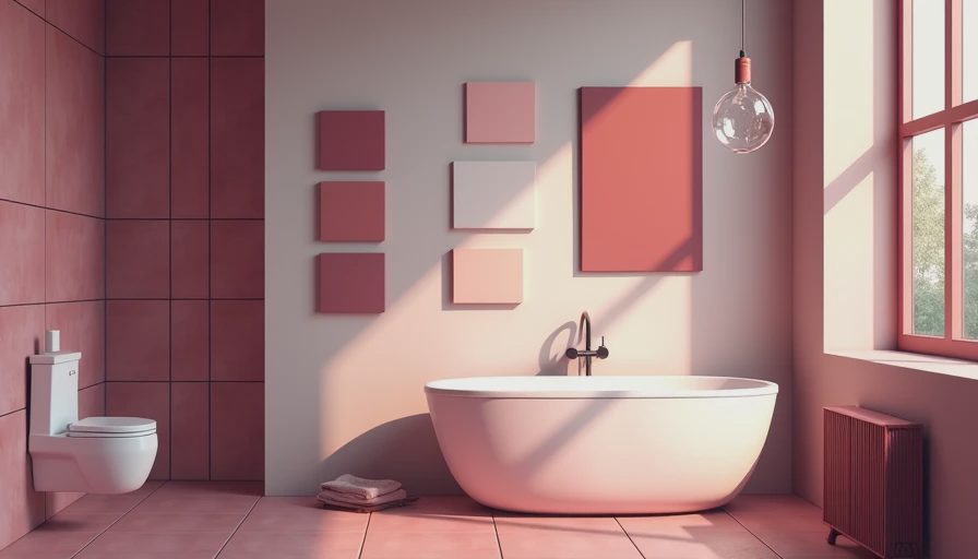
A powder room gives you permission to be braver. Because it is usually separated from the main living spaces and used for shorter visits, deeper bathroom paint colors can feel wonderfully enveloping. Think olive, chocolate brown, ink blue, clay, or a moody charcoal with a warm undertone.
The trick is to repeat one element so the drama feels intentional. If you choose a deep green wall, echo it in a hand towel or a small botanical print. If the vanity is painted, let the walls support it instead of competing with it. Brass sconces, a framed mirror, and a patterned fabric shade can make a small room feel collected rather than crowded.
Dark paint does not automatically make a powder room feel smaller. Glossy or reflective finishes, a well-placed mirror, and good lighting keep the room from closing in. What does make a small bath feel tight is poor editing: too many containers, an oversized piece of art, or a shower curtain that visually cuts the room in half.
Match the Finish to Real Family Life
Color gets the attention, but paint finish does the hardworking part. Bathrooms need a coating that can handle humidity and occasional cleaning. A washable satin or eggshell finish is often a practical choice for walls, while semi-gloss remains useful for trim and doors. Follow the paint manufacturer’s recommendations, particularly if the room has limited ventilation.
In a bathroom used by children, I would rather choose a durable mid-tone color than a precious pale shade that shows every splash. A soft mushroom, muted blue, or gentle green can hide everyday marks better than stark white while still looking polished. Keep a small amount of leftover paint labeled with the room and date; future touch-ups become much less mysterious.
Ventilation matters, too. Run the exhaust fan during showers and for a while afterward, and repair peeling or bubbling paint before applying a new color. A beautiful shade cannot compensate for moisture problems underneath it. Good preparation is not glamorous, but it is what keeps the finished room looking good beyond the first photograph.
A Simple Way to Choose Your Shade
When comparing bathroom paint colors, narrow the options to three samples: one safe choice, one warmer or cooler variation, and one color with a little more personality. Place each sample near the mirror, vanity, and largest tile area. Live with them for at least a day.
Notice what each shade does to your skin, towels, and lighting. If the mirror makes everyone look gray, the color may be too cool. If the room feels yellow even with daylight, choose a less creamy option. If one sample looks beautiful in every lighting condition, you have probably found your answer.
Remember that paint is one of the least permanent decisions in a room. You can repaint a small bathroom for the cost of a weekend and a few supplies, while the right color may make you enjoy the space every morning. Choose a shade that supports the way your home lives, not just the way a styled photograph looks. A soft room is a room that breathes. Let’s make yours exhale.