There is a particular kind of tired that makes you want your home to lower its voice. Not sterile white, not a room so beige it disappears, but a space that welcomes you through the door and lets your shoulders drop. That is the quiet magic of calming colors. They create a visual rhythm that feels gentle, especially when life includes school bags, laundry baskets, a cat who believes every chair belongs to her, and dinner happening later than planned.
I think of color as the first layer of hospitality. Before anyone notices the lamp or the pretty trim, they feel the room’s temperature. Soft blue can feel open and airy. A muted green can bring the steadiness of a garden indoors. Warm sand, mushroom, and pale clay can make a large room feel gathered rather than cavernous. The best calming colors are not necessarily pale; they are simply softened, balanced, and easy to live with.
Start with the light your room already has
The same paint color can look completely different from one room to the next. A north-facing bedroom may turn a pale gray-blue cool and silvery, while afternoon light in a south-facing room can make that same color look almost mint. Before choosing a gallon of paint, tape large samples to two or three walls. Look at them in the morning, at lunchtime, and after the lamps come on.
If your room has warm wood floors, honey-colored furniture, or brass hardware, a blue with a slightly gray or green undertone will usually feel more connected than a crisp, icy blue. If the room is filled with cool marble or charcoal upholstery, creamy white and warm taupe can keep it from feeling chilly. Calming colors work best when they cooperate with what is already in the room instead of demanding a complete reset.
Do not judge a sample beside a bright white switch plate and call it finished. Place it near the sofa, curtains, rug, and flooring. Paint is a team player, and it needs to see the whole team before you make a decision.

The most useful calming colors for everyday rooms
Blue is the obvious favorite, but the right blue is quieter than a nursery blue. Try dusty denim, faded slate, or a blue-gray that resembles the sky just before rain. These shades are especially lovely in bedrooms, bathrooms, and reading corners because they have a naturally restful quality without feeling flat.
Green brings a different kind of calm. Sage, eucalyptus, olive-gray, and soft moss can make a family room feel grounded. I love green with natural linen, rattan, walnut, and aged brass. It also behaves beautifully beside houseplants, even when your actual plant-care record is less than heroic.
For a warmer scheme, look at oatmeal, putty, mushroom, warm ivory, and pale terracotta. These are calming colors with enough pigment to feel intentional. A mushroom wall can make white curtains look crisp and a worn leather chair look completely at home. Pale clay works beautifully in a dining room, where candlelight adds another layer of warmth.
Build a palette instead of picking one perfect shade
A peaceful home rarely depends on one color repeated from ceiling to baseboard. It usually has a small family of related shades. Choose one main wall color, one supporting neutral, and two or three accents. For example, a soft sage wall might meet warm ivory drapery, oatmeal upholstery, faded blue pillows, and a little rust in the artwork.
The secret is repetition without duplication. Let a color appear at least twice, but not in exactly the same form. A blue-gray pillow can echo a blue line in a rug and a small painted detail in a piece of art. That repetition helps the room feel collected. Matching every item too closely makes a space feel purchased in one afternoon.
Pay attention to texture, too. Linen, cotton, wool, cane, wood, and matte ceramics keep calming colors from becoming sleepy. A flat beige room can feel dull; the same palette with a nubby throw, pleated shade, woven basket, and slightly rumpled linen can feel wonderfully alive.
Use fabric to test the feeling
Paint samples tell only part of the story. Fabric is where a color becomes personal. Hold a curtain or pillow swatch against the wall and notice whether the room feels softer or more restless. A solid linen panel in a warm neutral can calm a window without blocking the light. A small-scale stripe can add structure while remaining quiet enough for a bedroom.
For homes with children and pets, choose beauty that can take a little living. Performance fabrics have improved considerably, and a washable cotton blend can be a smart choice for a sofa or breakfast nook. I would rather see a forgiving fabric with a few honest creases than a precious textile everyone is afraid to touch. A soft room is a room that breathes. Let yours exhale.
Curtains deserve special attention because they occupy so much visual space. If your walls are already colorful, choose a related neutral with a woven texture. If the walls are creamy, a faded sage or dusty blue panel can frame the view and add depth. Keep the hardware simple and hang the rod high enough to make the window feel generous.
Where to place color when you rent or like to change things
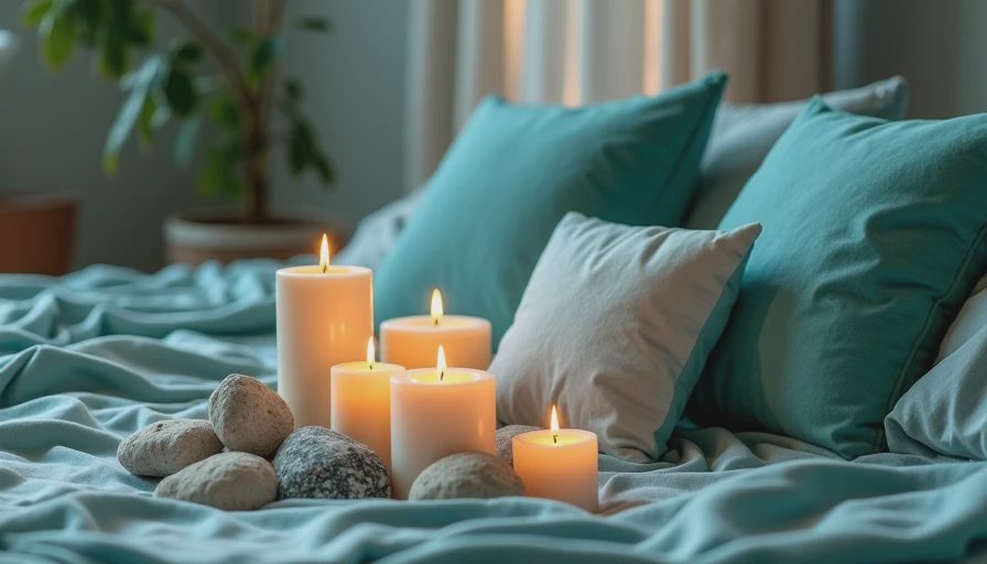
You do not need permission to make a rental feel restful. Begin with removable layers: a washable rug, linen-look curtains, artwork, lampshades, and pillow covers. A muted blue throw over a gray sofa can change the entire mood for less than repainting. Slipcovers, if they fit well, offer another practical way to shift a room without buying new furniture.
In a permanent home, consider the overlooked surfaces. The inside of a bookcase, a powder room ceiling, or the back of a mudroom door can hold a deeper shade without overwhelming the house. These small moments are especially useful if you love color but want the main rooms to remain flexible.
When you are unsure, choose the color that looks good beside your favorite everyday object. It might be a framed landscape, a brown ceramic vase, or the old quilt folded at the foot of the bed. A palette tied to something you already love will feel more natural than one copied from a showroom.
A simple plan for a calmer room
Begin by removing colors that are competing for attention. You do not have to empty the room; simply gather a few pillows, accessories, or small art pieces and see what changes. Then choose your anchor: the rug, sofa, curtains, or largest painted wall. Let that piece establish the direction.
Add one lighter layer, one deeper layer, and one living accent. In a bedroom, that could mean warm ivory walls, a faded blue quilt, a walnut nightstand, and leafy green from a plant. In a living room, it might be mushroom upholstery, sage curtains, cream lampshades, and a little terracotta in the artwork. Calming colors become convincing when the eye can travel comfortably from one layer to the next.
Give the room a week before making another major purchase. Live with the morning light, the evening lamps, and the inevitable toy on the floor. If the palette still feels welcoming on an ordinary Tuesday, you have found something worth keeping. The goal is not a perfect photograph. It is a home that helps you come back to yourself.